
Travel Websites That Will Get You Moving#
Pack your bags. We’re going on vacation!
That’s exactly what an effective travel website should make you feel. It should activate the travel bug with vibrant imagery and vivid copy.
And while photos can do a lot of the work in inspiring visitors, a travel site can’t accomplish its purpose without great web design.
Web design plays a major role in visitors’ first impressions of a business. In fact, in one study, when participants were asked why they distrusted a website. For a travel site, this means that design can be the determining factor in whether a visitor trusts recommendations and information.
And considering the significant investments that go into planning a trip, trust is essential.
It can make or break a traveler’s decision to take a certain tour, stay at a certain hotel, or even visit a city or country altogether.
Plus, beyond serving as a trustworthy source of inspiration, a travel site also needs to give would-be travelers all the information they need to arrange their travel plans.
Once a visitor is convinced that they need to see the sights in the photos for themselves, it should be easy for them to plan their trip.
This means that the site needs to have straightforward travel information, helpful logistical details, and tips that will help visitors simplify the travel process.
Not all travel sites tick all of these boxes, but the ones that do stand out from all the rest.
So whether you’re considering launching a new travel site, or you’re ready to improve an existing one, you want to make sure you leave no stone unturned
What should a travel website include?
There are tons of different types of sites that fall under the travel site umbrella.
The design elements you need depend on the type of site you’re running.
An official tourism site for a city will have different goals from those of a travel blogger or tour company.
So as you read through this post, keep in mind that not all of the recommendations will apply to your site.
But in general, the ideal travel website should include a mix of the following:
- High-quality photography
- A brief summary of the area, with highlights of important places
- Hotel recommendations with web links to hotel and booking sites
- Information about recreation and outdoor activities
- Guides to arts and culture, including museums, theaters, and other attractions
- Packing tips
- Maps and guides
- Public transport information
- Airport information
- Relevant tips on language and local dialect
Of course, your site likely won’t need to include all of the elements on this list. Tailor it to your needs.
And there’s tons of example travel sites that we can use for inspiration. Let’s get started.
1. Telluride, Colorado
The first site on our list is the official tourism guide to the city of Telluride, Colorado.
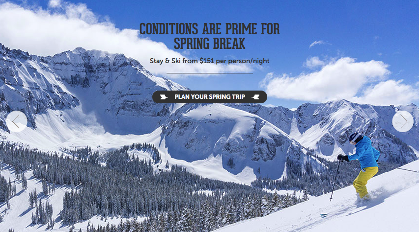
Right from the start, a prominent image gallery does a lot of the selling on the website for Telluride.
By making the images so large, the site makes sure the first thing you see is a beautiful landscape.
This is an example of a site that relies less on copy. Instead of a detail-heavy approach, the design focuses more on the picturesque views and various activities in action.
Once a visitor is drawn in by the photos, they can opt to click on the main call to action, “Plan Your Spring Trip” for more information.
From there, visitors can read about the various activities they can do in the city, then purchase any necessary tickets, passes, or equipment rentals.
This approach works, because it combines attention-grabbing imagery with a clear call to action.
Many Internet users have short attention spans, so it’s important to give them the opportunity to take action as soon as possible. Don’t make them think, wait, or read too much copy before giving them the opportunity to convert.
2. Visit Brasil
3. On the Grid
4. Cookiesound
5. Toucan Cafe & Tours
6. Wheeling, West Virginia
7. Utah, Life Elevated
8. Travel Oregon
9. Visit Australia
Visit Brasil is the country’s official tourism site.

On the surface, you might think that arranging this site would be a simple process.
After all, how difficult could it be to persuade visitors to check out beautiful beaches and hikes through the Amazon?
But considering that Brazil is a huge country, making up almost half of the continent of South America, the site has a lot of information to cover.
It does this by dividing the various regions into different “Experiences.”
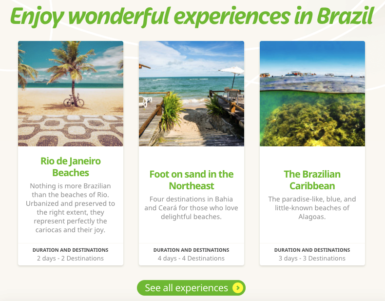
By breaking the country into smaller, more manageable areas, the site aims to create a virtual travel experience that allows the user to explore the sights of Brazil right from their computer.
This can help visitors decide where they want to go within this massive country. If they’re looking for a relaxed beach trip, for example, they’ll have very different options from travelers looking for hiking trips or adventure tours.
Then, once a visitor has selected a destination, the breakdowns on the site will give them an accurate idea of what they can hope to see within the span of their trip.
Unlike the previous two examples, which centered on one city and one country, On the Grid is a travel blog spanning many countries and continents.
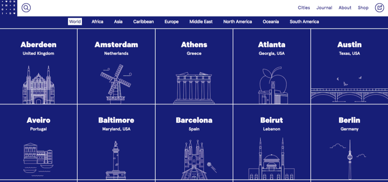
As a result, the site requires a very different type of organization.
Instead of letting visitors jump right into information about hotels and activities, the main navigation bar is organized by region.
Then, the homepage features an alphabetical list of city guides, from Aberdeen to Zurich.
[tweet_box design=”default”]This level of organization makes it easy for users to access information, whether they’re looking for a guide to a specific city or simply browsing for trip inspiration.[/tweet_box]
Cookiesound is another travel blog that focuses on sharing personal stories from a mother-daughter photographer team.

The pair has made a name for themselves taking photos around the world, and they’ve created a nice compilation of their journeys.
And while the photos are likely what initially draw readers in, what sets this site apart from others is the personal perspective. You can tell that this site was made out of a passion for traveling.
So if you’re running a travel blog, it’s important to remember that photos can’t do all the work for you in building an audience and establishing a loyal reader base.
Make sure to spend just as much time creating interesting, well-written content for your site, and you’ll be much more effective in reaching your site’s goals.
Toucan Cafe is a Medellin coffee shop that also runs tours and language exchanges.
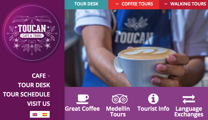
Their site is exceptionally comprehensive. It features different types of tours and details about the cafe, as well as general tourist information for visitors to the city.
Best of all, everything is easily accessible from the big menu bar. Given that the site is designed to provide information about very distinct categories, it’s essential that visitors can immediately find what they’re looking for.
After all, if a user were to arrive looking for details on a walking tour, but think they’d mistakenly come to the website of a random coffee shop, Toucan would quickly lose a potential customer.
But this straightforward navigation setup eliminates that issue and makes it easy for users to access the information they need.
Plus, it’s worth noting that all of the content on the site is available in Spanish and English.
While some of the company’s customers might be traveling within Colombia, they’ve clearly determined that many of their tour attendees come from English-speaking countries.
By making all of their information available in English, Toucan expands their audience and makes sure they don’t miss out on potential customers because of a language barrier.
As you may have guessed, this is the official tourism site for the city of Wheeling, West Virginia.

The site features a series of high-quality images on its homepage that highlight the various activities available to visitors within the city.
From there, the page is divided into sections that cover hotels, restaurants, recreation, and other activities.
If this doesn’t sound like a novel approach, that’s because it isn’t.
But the site makes it easy for visitors to see why they should visit the city, as well as access all of the information they need to plan their trip.
In this case, simplicity works.
[tweet_box design=”default”]As you plan your site, remember not to get caught up in flashy design elements.[/tweet_box]
While a unique site can help you stand out, your priority should be to create a user-friendly experience that enables visitors to plan their next trip.
Life Elevated is the tourism site for the state of Utah.

Much like many of the sites on this list, the homepage features large, compelling images of scenic destinations.
Then, users can click the featured call to action to learn more about the location in the photo.
This combination is extremely effective. The image elicits an emotional response, and the action-oriented text encourages visitors to put that excitement towards their own adventure.
But if you choose to take a similar approach, then pay attention to the size and quality of your images.
First, make sure that if you feature an image on your homepage, it’s high in quality. Grainy, low-quality photos won’t do you any favors in conveying the beauty of a location.
Then, always optimize your file sizes. Many site owners make the mistake of including massive image files on their homepages.
While these might look great, they can drastically slow down page load times.
And considering the impact that page speed has on page views, customer satisfaction, and conversion rates, it’s not something you can afford to damage.
So as you incorporate photos into your site, and especially onto your homepage, pay attention to file size. Your files should be large enough to produce high-quality detail, but not so big that they slow down your site.
As a general rule of thumb, your images should be 100KB or less.
After all, beautiful photos won’t do you any favors if no one sticks around long enough for them to load.
Crop your images to the necessary size and compress them before uploading, and they’ll be much more helpful in moving you towards your site’s goals.
One of the most creative sites on this list is Travel Oregon.

Like many of the other examples on this page, it’s designed to attract visitors to the state.
But unlike any of the others, it presents the various regions and attractions with a video game-inspired design.
The homepage begins by explaining that “Oregon is magic,” then encourages visitors to learn more about the state with choose-your-own-adventure style calls to action like, “Wander into the forest,” “Visit the Rose City,” and “See the magic Coast.”
From there, each of these calls to action directs users to more information (and real photos) of their selected region.
This kind of spin on website design isn’t for everyone. But for the fun, laid-back feeling Oregon is aiming to convey on their site, it’s perfect.
It’s also a fantastic reminder that travel sites can be as unique as the destinations they promote.
While there are a few basic elements you’ll need to include, feel free to get creative with the way you arrange them and present information.
Although Australia’s official website includes plenty of eye-catching photos for visitors to check out, it also takes things a step further by heavily incorporating video into the mix.
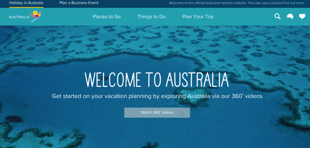
Like many travel sites, it’s designed to encourage visitors to learn more about specific regions of the country, so they can determine which is best-suited to what they’re looking for in a trip.
And in addition to high-quality photos and compelling descriptions of each, the site also offers 360º videos. These give a more in-depth look than even the most high-quality photos could, so visitors can choose a vacation spot and explore it from the comfort of their home.
Interactive elements are becoming increasingly popular in web design for many industries. But in many cases, it feels like they only exist for the sake of checking “interactive” off on an arbitrary list of design elements.
So if you choose to include interactives, it’s important that they serve a clear purpose and don’t come off as gimmicky.
In this case, Visit Australia’s 360º videos are a fun, engaging addition to the site. They’re a special way to highlight different locations throughout the country, and add value to the overall site experience.


No comments:
Post a Comment